Home>Our Kitchens>Transitional

West Hill Kitchen

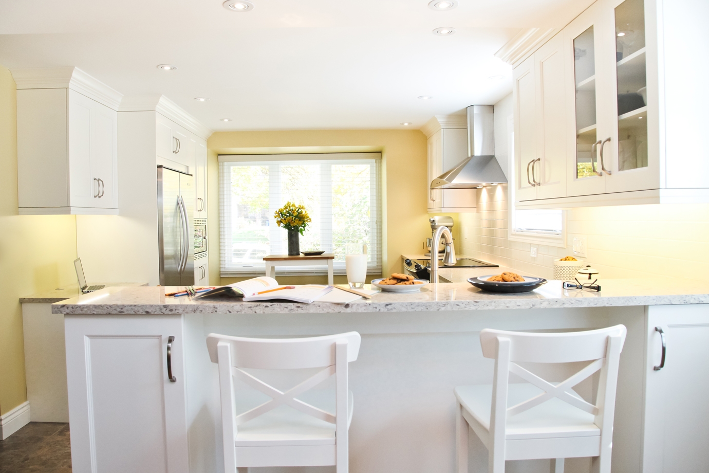
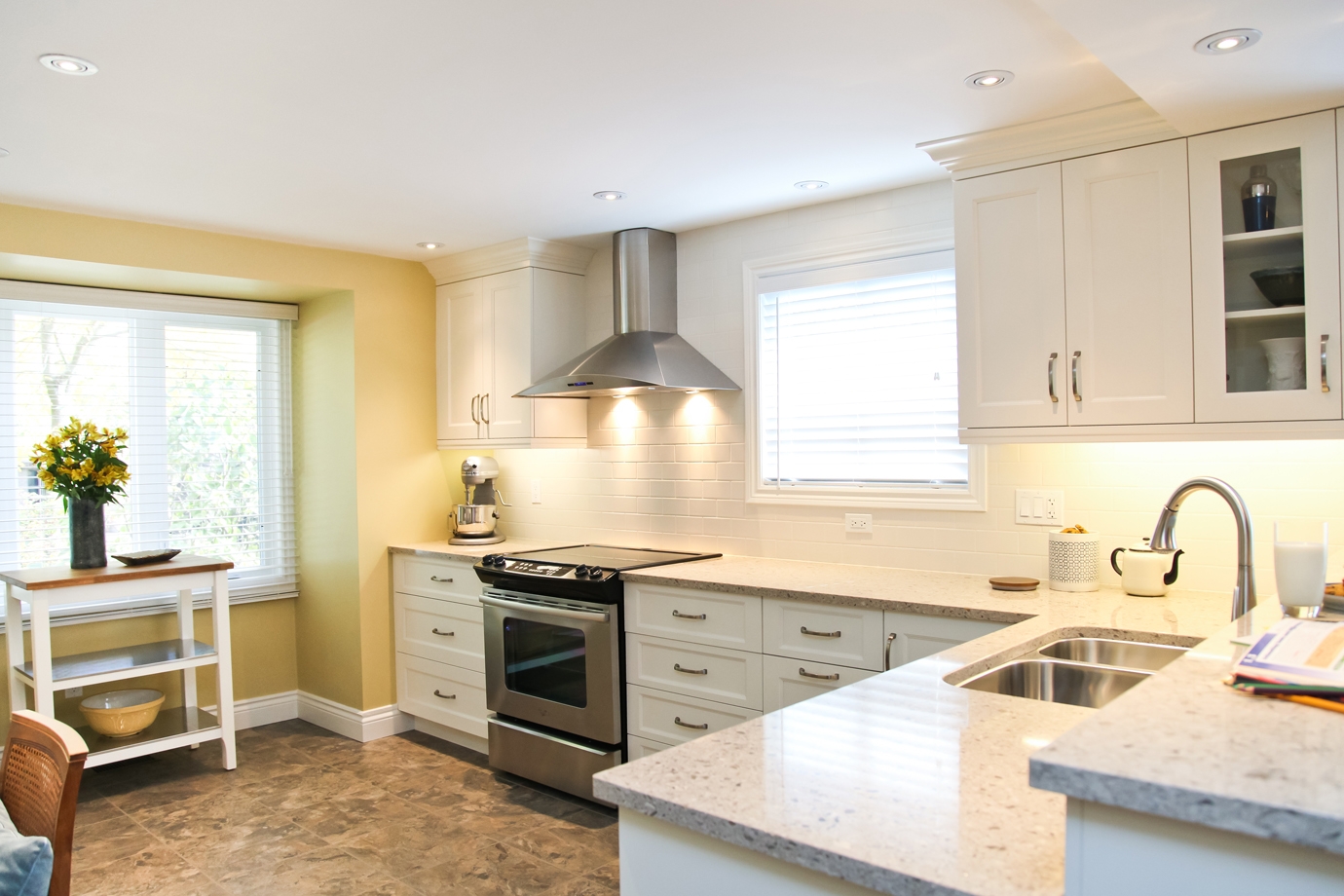
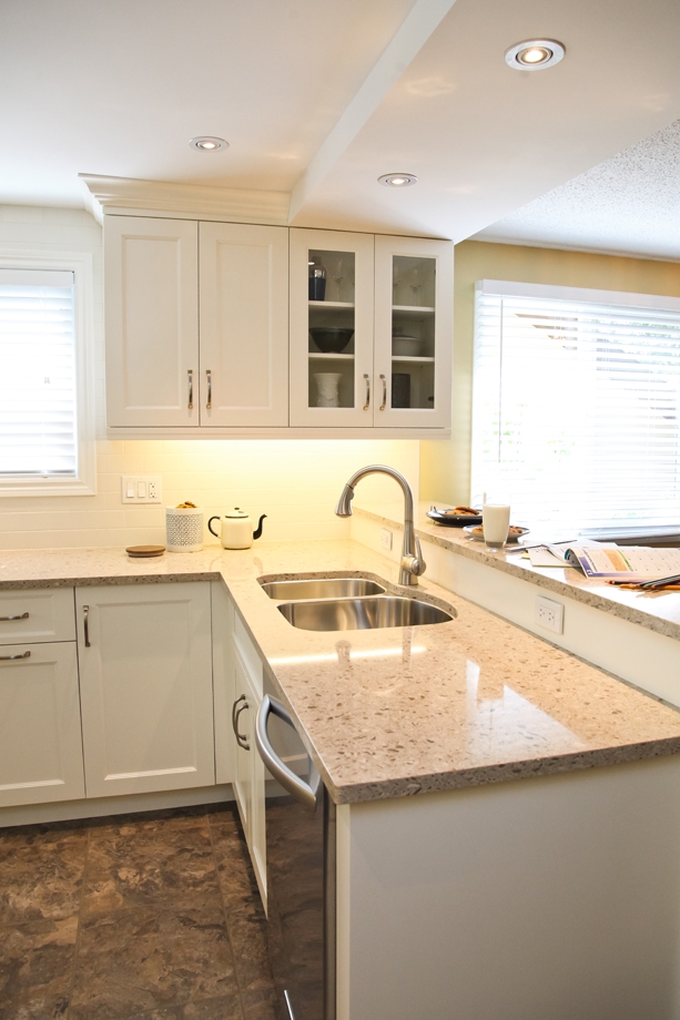
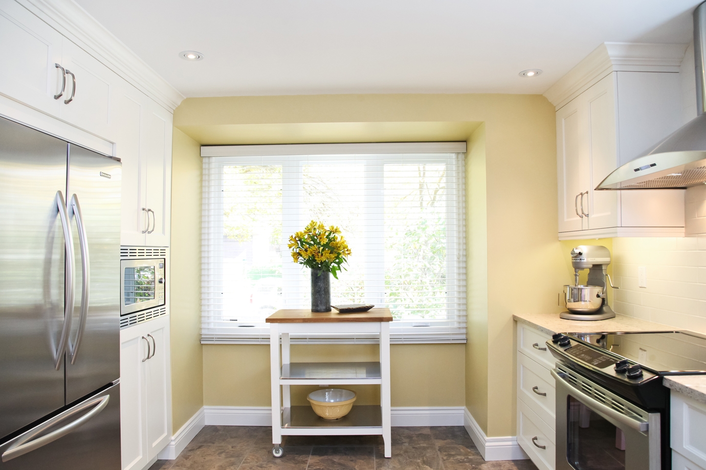
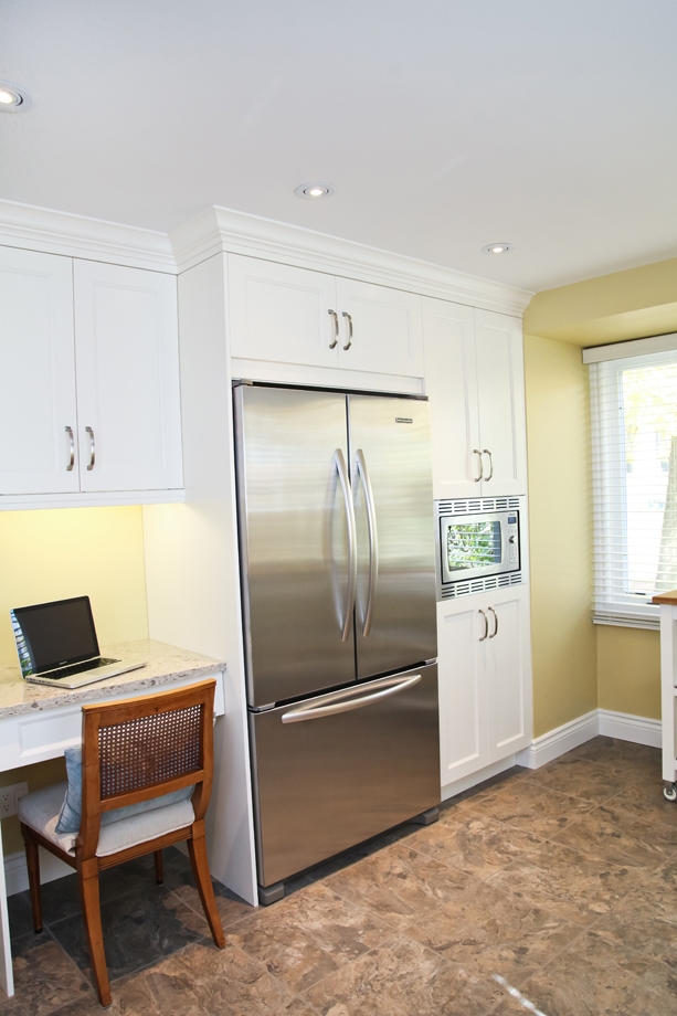
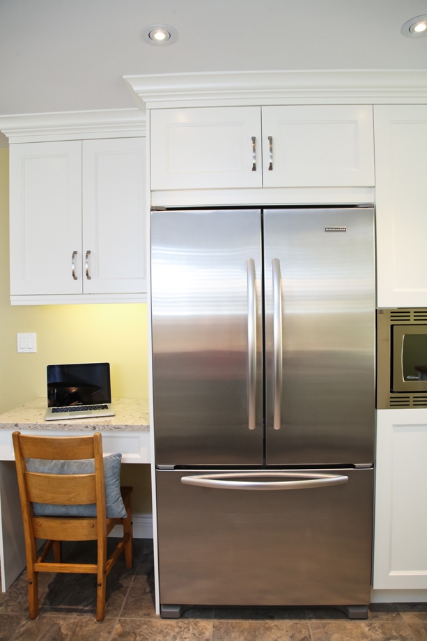
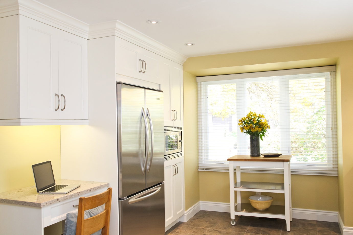
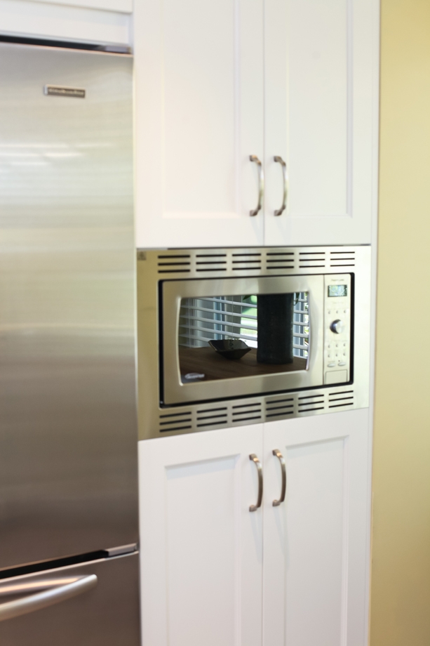
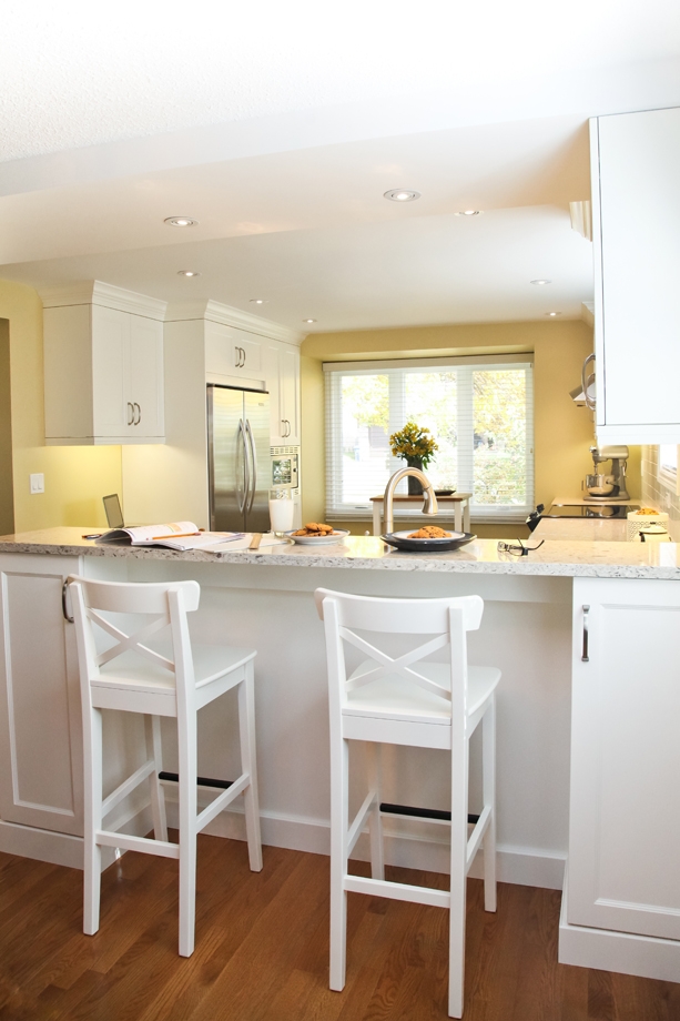
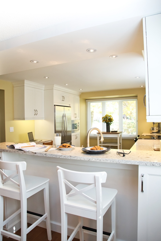
Light, bright and airy are words evoked by this family kitchen. It was previously a dark, closed-in kitchen, but with the removal of the wall to the living/dining room, the space has been dramatically transformed. This kitchen is a perfect example of how a small area can feel expansive with great design and smart finishing choices.

Style

Transitional

Location

Guelph, ON

Cabinet Features

Maple

Countertops

Cambria Quartz

Style

Transitional

Location

Guelph, ON

Cabinet Features

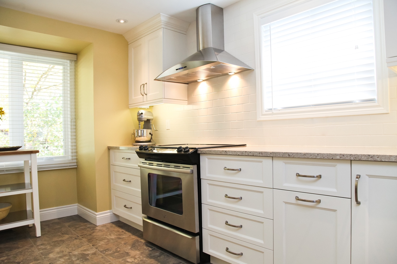
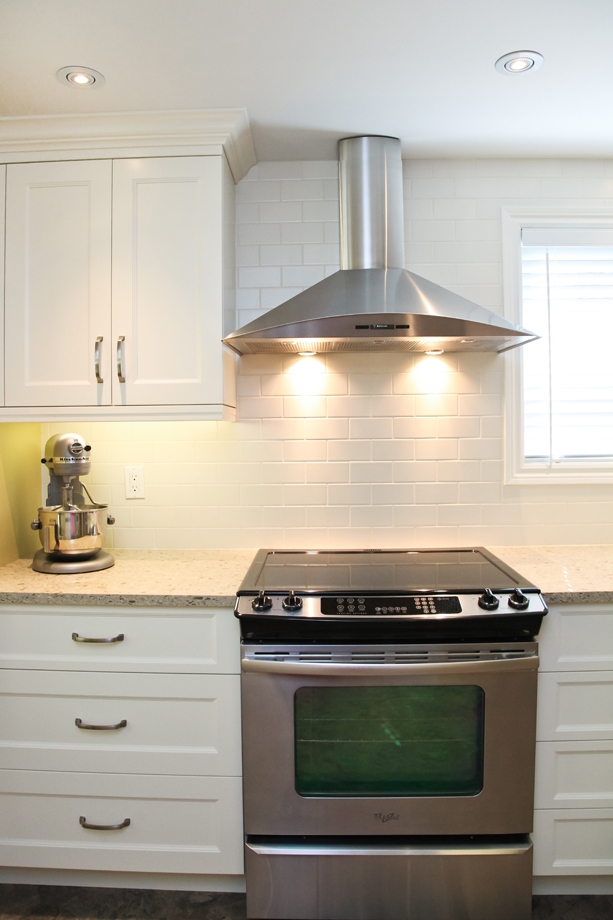
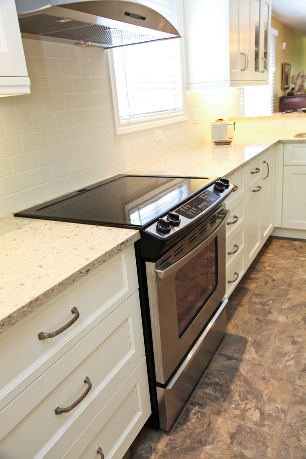
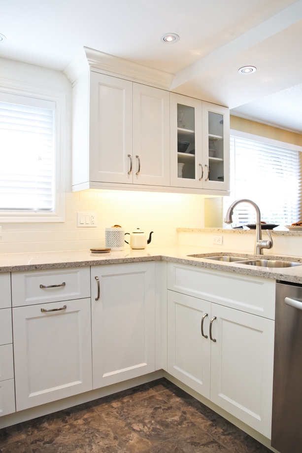
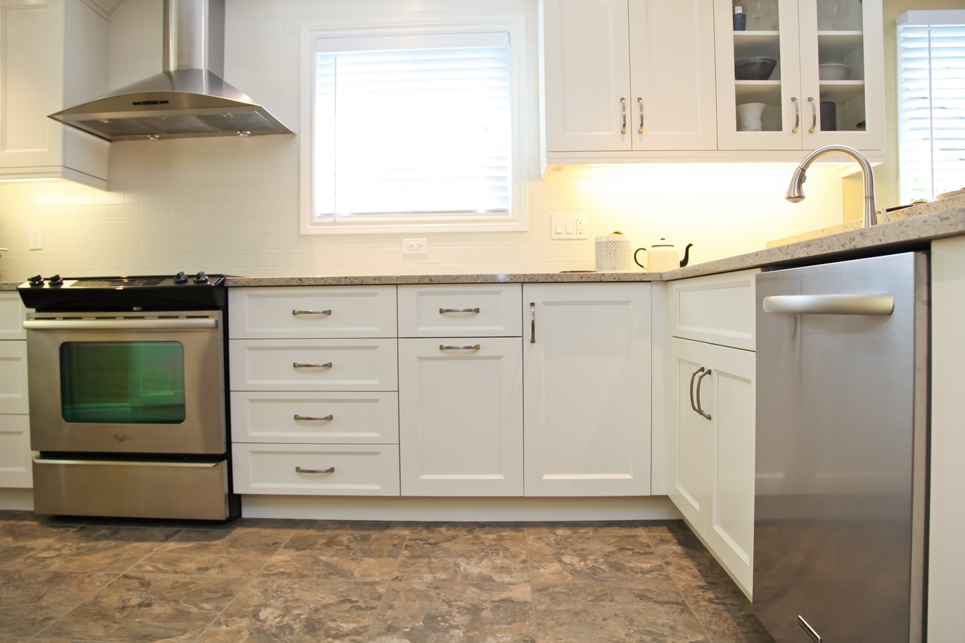
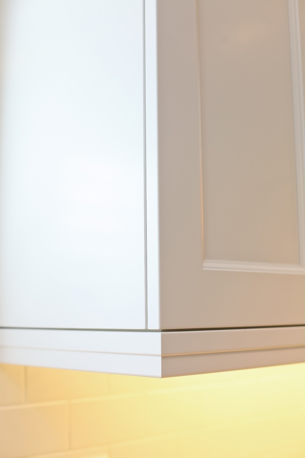
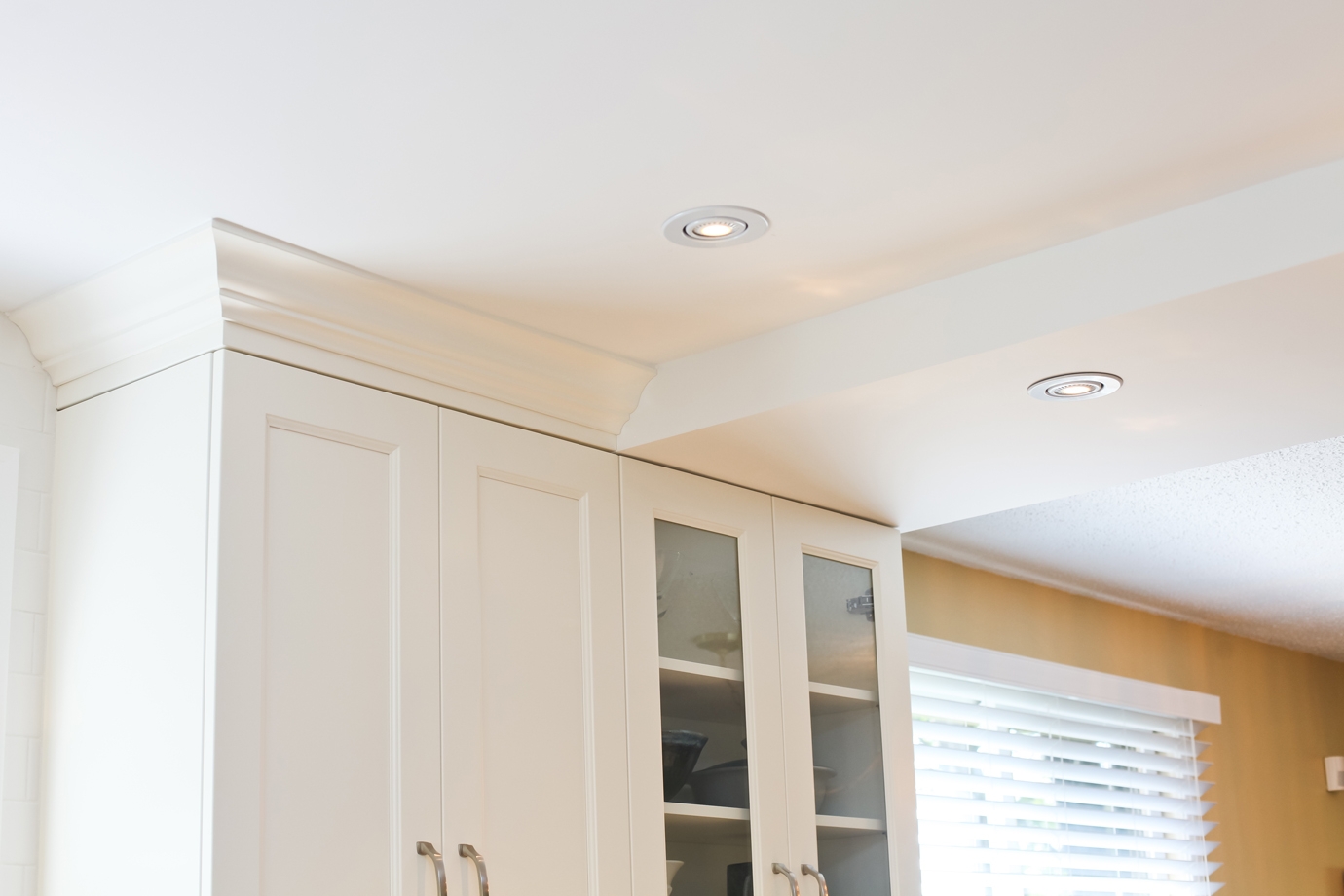
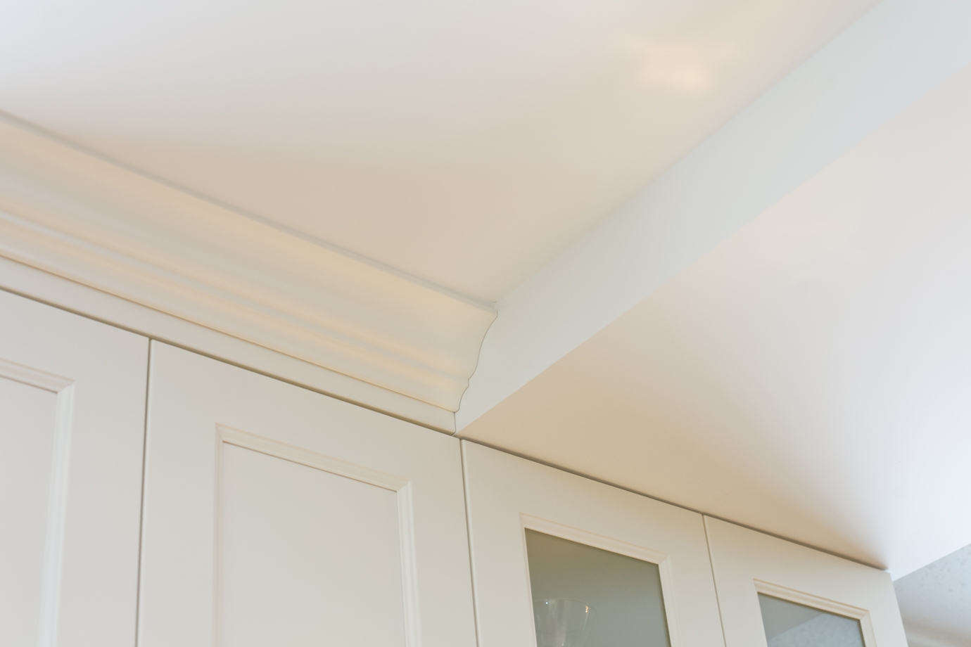
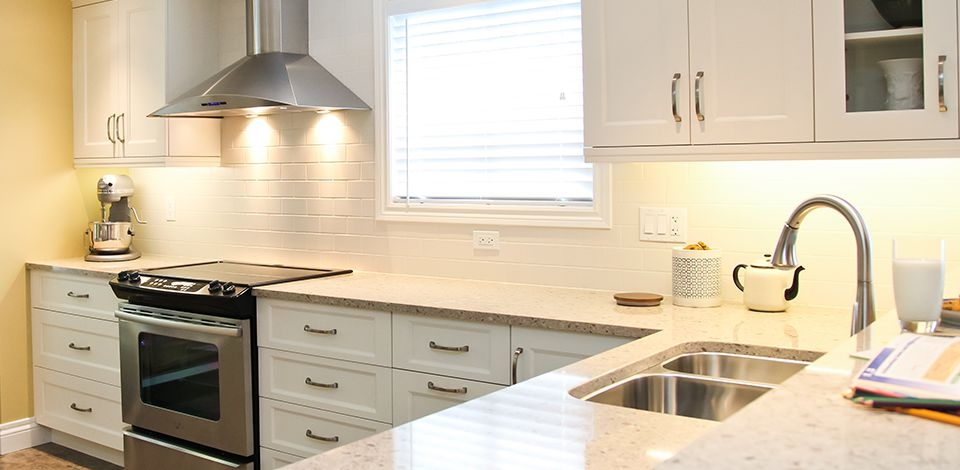
Painted maple doors in "Cloud White" with glass-fronted feature doors all in a modified shaker profile. 

Countertops

Cambria Quartz in "Darlington" 

Notable Details

Blanco sink & faucet, stainless steel appliances white subway tile, brushed nickel hardware

1

White cabinets in a simple recessed panel profile helps lighten up a smaller space. This kitchen is a perfect example of how a small area can feel expansive with great design and smart finishing choices.

2

While we usually prefers islands, a peninsula can be a great solution for smaller spaces - it increases counter space and storage and provides a transition to adjoining rooms.

3

A classic colour palette of quiet neutrals is punched up by a bright yellow for the wall.

4

The freestanding stainless steel hood is not only functional for ventilation, it also provides a focal point to this kitchen.

5

The light and neutral colour palette of the kitchen, from the floors to the countertops, allow the space to appear larger and more expansive.

6

Adding a set of glass-fronted cabinetry adds an element of shine and style - it's a great opportunity to display collectibles. The width of the bulkhead was carefully planned to be the same width as the glass cabinets to achieve visual balance.

7

Undercabinet lighting and potlights provide ambient and task lighting.

8

A simple recessed panel, modified shaker door profile provide interest without being ornate or overbearing. This is complemented by graceful brushed nickel handles.

9

Creating visual balance is much more than symmetry - it's about creating clean lines through the crown moulding, spacing the height and width of the upper and lower cabinets evenly, and being mindful of negative space.

10

A desk area is the perfect spot for a communication centre and a place to tuck away all the knickknacks that gather in a kitchen.

11

A desk area is the perfect spot for a communication centre and a place to tuck away all the knickknacks that gather in a kitchen.

12

A desk area is the perfect spot for a communication centre and a place to tuck away all the knickknacks that gather in a kitchen.

13

The built-in microwave is perfectly placed in the pantry area and no longer takes up prime counter space.

14

A closer look at the tiered light valance - its simple profile is in keeping with the minimal door profile.

15

We planned around a necessary structural element by designing a bulkhead to be the same width as the glass cabinets and the same height as the crown & sub mouldings.

16

We planned around a necessary structural element by designing a bulkhead to be the same width as the glass cabinets and the same height as the crown & sub mouldings.

17

Beautiful light filters in from all sides of this kitchen, now that the wall between the dining room and kitchen was removed. The bulkhead above the peninsula marks where this old wall was.

18

What a perfect spot to perch on this peninsula bar area! We are never one to miss storage opportunities, so we made sure to add a couple of functional cabinets to frame the peninsula.